

Management and planning tools include:
- Affinity diagrams
- Matrix diagrams
- Interrelationship digraphs
- Process decision program charts
- Tree diagrams
- Activity network diagrams
- Prioritization matrices
Formal research on the seven new quality tools began in 1972 as part of the Japanese Society of QC technique development meetings. It took several years of research before the seven new tools were formalized. The original seven tools of quality (scatter diagram, flow charts, histogram, etc.) were adequate for data collection and analysis. However, the new tools allow for more identification, planning, and coordination in finding a problem solution. The seven new tools, as written by Japanese authors Mizuno Shigeru (1988) and Asaka Tetsuichi and Ozeki Kazuo (Tetsuichi, 1990), are:
- Relations diagram
- Affinity diagram (KJ method)
- Systematic diagram
- Matrix diagram
- Matrix data analysis
- Process decision program chart (PDPC)
- Arrow diagram
Translating the seven new tools into English provided a better U.S. understanding. Later, these tools were modified and adapted to the American industry. Goal/QPC (Brassard, 1989) (Domb, 1994) formed the statistical resource committee which modified the seven new QC tools to a similar set of seven management and planning tools. A few of the names were changed. One tool was modified. They are identified by the corresponding Japanese sequence number and are listed below:
2. Affinity diagram
3. Tree diagram
6. Process decision program chart (PDPC)
5. Matrix diagram
1. Interrelationship digraphs (l.D.)
4. Prioritization matrices
7. Activity network diagram
Affinity Diagrams
The affinity diagram is a technique that an individual or team can use for problem-solving. Affinity encourages creativity by everyone on the team at all phases of the process. Affinity Diagrams break down longstanding communication barriers. Affinity Diagrams encourages creativity by everyone on the team at all phases of the process. It can break down longstanding communication barriers. It can encourage non-traditional connections among ideas/issues. It allows breakthroughs to emerge naturally, even on long-standing issues. It encourages “ownership” of results that emerge because the team creates both detailed input and general results. It can overcome “team paralysis,” which is brought on by an overwhelming array of options and lack of consensus. It encourages non-traditional connections among ideas/issues. It allows breakthroughs to emerge naturally, even on long-standing issues. IT Encourages “ownership” of results that emerge because the team creates both the detailed input and general results. It overcomes “team paralysis,” which is brought on by an overwhelming array of options and lack of consensus. Unfamiliar problems may present difficulties to the group. This technique is beneficial for new or complex problems. The affinity diagram appears similar to the mind mapping technique, in that one generates ideas that link up to other ideas to form thought patterns. The affinity diagram uses an organized method to gather facts and ideas to form developed patterns of thought. To allow a team to creatively generate a large number of ideas/issues and then organize and summarize natural groupings among them to understand the essence of a problem and breakthrough solutions. It can be widely used in the planning stages of a problem to organize ideas and information. The steps can be organized as follows:
- Define the problem under consideration.
- Have 3” x 5” cards or Post-it® notes available.
- Enter ideas, data, facts, opinions, etc. on the cards or notes.
- Place the cards or notes on a conference table or on a wall.
- Arrange the groups into similar thought patterns or categories.
- Develop a main affinity category for each similar group of ideas.
- Once all of the cards have been placed under an appropriate affinity category, borders can be drawn around each affinity group to complete the diagram. The affinity diagram is also referred to as the KJ Method. It was developed by Dr. Kawakita Jiro, founder of the Kawayoshida Research Center.


Software development process affinity diagram
Affinity Diagrams Example:
- Phrase the issue under discussion in a full sentence.
| What are the issues involved in planning fun family vacations? |
|---|
From the start, reach a consensus on the choice of words you will use. Neutral statements work well, but positive, negative, and solution-oriented questions also work.
2. Brainstorm at least 20 ideas or issues
a) Follow guidelines for brainstorming.
b) Record each idea on a Post-it® Note in bold, large print to make it visible 4–6 feet away. Use at minimum, a noun, and a verb. Avoid using single words. Four to seven words work well.


Affinity Diagrams ideas
A “typical” Affinity has 40–60 items, it is not unusual to have 100–200 ideas.
3. Without talking: sort ideas simultaneously into 5–10 related groupings
a) Move Post-it® Notes where they fit best for you; don’t ask, simply move any notes that you think belong in another grouping.
b) Sorting will slow down or stop when each person feels sufficiently comfortable with the groupings.


Affinity diagram grouping
Sort in silence to focus on the meaning behind and connections among all ideas, instead of emotions and “history” that often arise in discussions. As an idea is moved back and forth, try to see the logical connection that the other person is making. If this movement continues beyond a reasonable point, agree to create a duplicate Post-it®. It is okay for some notes to stand alone. These “loners” can be as important as others that fit into groupings naturally.
4. For each grouping, create summary or header cards using consensus
a) Gain a quick team consensus on a word or phrase that captures the central idea/theme of each grouping, record it on a Post-it® Note and place it at the top of each grouping. These are draft header cards.
b) For each grouping, agree on a concise sentence that combines the grouping’s central idea and what all of the specific Post-it® Notes add to that idea; record it and replace the draft version. This is a final header card.
c) Divide large groupings into subgroups as needed and create appropriate sub headers.
d) Draw the final Affinity Diagram connecting all finalized header cards with their groupings.


Spend the extra time needed to do solid header cards. Strive to capture the essence of all of the ideas in each grouping. Shortcuts here can greatly reduce the effectiveness of the final Affinity Diagram. It is possible that a note within a grouping could become a header card. However, don’t choose the “closest one” because it’s convenient. The hard work of creating new header cards often leads to breakthrough ideas.
Variations
Another popular form of this tool, called the KJ Method, was developed by the Japanese anthropologist Jiro Kawakita while he was doing fieldwork in the 1950s. The KJ Method, identified with Kawakita’s initials, helped the anthropologist and his students gather and analyze data. The KJ Method differs from the Affinity Diagram described above in that the cards are fact-based and go through a highly structured refinement process before the final diagram is created.

Spend the extra time needed to do solid header cards. Strive to capture the essence of all of the ideas in each grouping. Shortcuts here can greatly reduce the effectiveness of the final Affinity Diagram. It is possible that a note within a grouping could become a header card. However, don’t choose the “closest one” because it’s convenient. The hard work of creating new header cards often leads to breakthrough ideas.
Variations
Another popular form of this tool, called the KJ Method, was developed by the Japanese anthropologist Jiro Kawakita while he was doing fieldwork in the 1950s. The KJ Method, identified with Kawakita’s initials, helped the anthropologist and his students gather and analyze data. The KJ Method differs from the Affinity Diagram described above in that the cards are fact-based and go through a highly structured refinement process before the final diagram is created.


Issues Surrounding implementation of the Business Plan
Interrelationship Digraphs (I.D)
The l.D. technique is ideal for complex problems. The I.D technique allows a team to systematically identify, analyze, and classify the cause-and-effect relationships that exist among all critical issues so that key drivers or outcomes can become the heart of an effective solution. If the issue is very complex, exact relationships may be difficult to determine. There may be intertwined causal relationships involved. The l.D. technique encourages team members to think in multiple directions rather than linearly. It explores the cause-and-effect relationships among all the issues, including the most controversial. It allows the key issues to emerge naturally rather than allowing the issues to be forced by a dominant or powerful team member. It systematically surfaces the basic assumptions and reasons for disagreements among team members. It allows a team to identify the root cause(s) even when credible data doesn’t exist. The idea is to have a creative, problem-solving process that will eventually indicate some key causes. In fact, the final “solution” to the problem will be determined when the team has analyzed the graph for the key causes. The interrelationship digraph can also be referred to as a relations diagram, although there are some minor differences in the uses of the digraph. Several other tools can be used as material for this technique. Affinity diagrams, tree diagrams, or cause-and-effect diagrams can provide input. Interrelationship digraphs can be created in the following fashion:
- Develop about 50 items that pertain to the basic problem. These probably should be on Postit® notes or 3” x 5” cards (l.D. cards).
- A decision is made to either place closely related items together right away, or to shuffle the cards for a random display on a table. The random method can be justified if one wishes to uncover different ways of looking at a problem. The early placement of closely related cards together may have a tendency to bias thought patterns.
- The fun begins with discussion regarding the placement of relationship arrows. The relationship arrow goes from the cause item to the effect item (cause —> effect). This is done for every card until completed.
- Since this technique presumes there is adequate time to study the problem at hand, several revisions can be made. The digraph can be copied onto a large sheet of paper and distributed to team members for review. The group can report back in a week or so to go over any revisions.
- Once the revisions have been made, a final draft of the digraph is created, and an analysis can be made. The drawing of arrows leading away or to certain (l.D.) cards can lead to inferences for the team to use.
- The team will develop a consensus on the items that need to be worked on right away. These key items should be the ones with the greatest number of connecting arrows. A high number of outgoing arrows indicates a root cause or driver. A high number of incoming arrows indicates an outcome. Select only a few key items for project work.

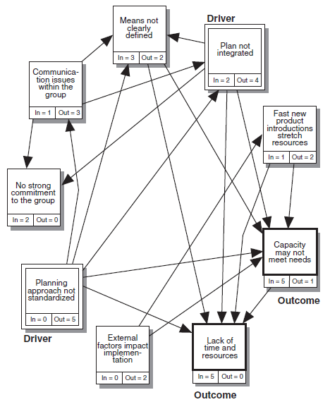
Issues Surrounding implementation of the Business Plan
Interrelationship Digraph (ID) Example:
1. Phrase the issue under discussion in a full sentence.
| What are the issues related to reducing litter? |
|---|
- If using an original statement (i.e., it didn’t come from a previous tool or discussion), create a complete sentence that is clearly understood and agreed on by team members.
- If using input from other tools, such as an Affinity Diagram, make sure that the goal under discussion is still the same and clearly understood.
2. Assemble the right team
- The ID requires more intimate knowledge of the subject under discussion than is needed for the Affinity. This is important if the final cause-and effect patterns are to be credible.
- The ideal team size is generally 4–6 people. However, this number can be increased as long as the issues are still visible and the meeting is well facilitated to encourage participation and maintain focus.
3. Lay out all of the ideas/issue cards that have either been brought from other tools or brainstormed
- Arrange 5–25 cards or notes in a large circular pattern, leaving as much space as possible for drawing arrows. Use large, bold printing, including a large number or letter on each idea for quick reference later in the process.


Interrelationship Digraph Idea
4. Look for cause/influence relationships among all of the ideas and draw relationship arrows
- Choose any of the ideas as a starting point. If all of the ideas are numbered or lettered, work through them in sequence.
- An outgoing arrow from an idea indicates that it is the stronger cause or influence.


one-way relationship arrows
Draw only one-way relationship arrows in the direction of the stronger cause or influence. Make a decision on the stronger direction. Do not draw two-headed arrows.
5. Review and revise the first-round ID
- Get additional input from people who are not on the team to confirm or modify the team’s work. Either bring the paper version to others or reproduce it using available software. Use a different size print or a color marker to make additions or deletions.
6. Tally the number of outgoing and incoming arrows and select key items for further planning
- Record and clearly mark next to each issue the number of arrows going in and out of it.
- Find the item(s) with the highest number of outgoing arrows and the item(s) with the highest number of incoming arrows.
- Outgoing arrows. A high number of outgoing arrows indicates an item that is a root cause or driver. This is generally the issue that teams tackle first.
- Incoming arrows. A high number of incoming arrows indicates an item that is a key outcome. This can become a focus for planning either as a meaningful measure of overall success or as a redefinition of the original issue under discussion.
Use common sense when you select the most critical issues to focus on. Issues with very close tallies must be reviewed carefully, but in the end, it is a judgment call, not science.
7. Draw the final ID
- Identify visually both the key drivers (greatest number of outgoing arrows) and the key outcomes (greatest number of incoming arrows). Typical methods are double boxes or bold boxes.

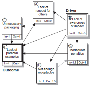
What are the issues related to reducing litter?
Variations
When it is necessary to create a more orderly display of all of the relationships, a matrix format is very effective. The vertical (up) arrow is a driving cause, and the horizontal (side) arrow is an effect. The example below has added symbols indicating the strength of the relationships. The ”total“ column is the sum of all of the ”relationship strengths“ in each row. This shows that you are working on those items that have the strongest effect on the greatest number of issues.


Tree Diagrams
The tree diagram is a systematic method to outline all the details needed to complete a given objective. The Tree diagram is used to break any broad goal, graphically, into increasing levels of detailed actions that must or could be done to achieve the stated goals. The tree diagram can also be referred to as a systematic diagram. It is an orderly structure similar to a family tree chart or an organization chart. The method of logic is similar to that of value analysis. The organization is by levels of importance (i.e., why – how, goals – means). The tree diagram encourages team members to expand their thinking when creating solutions. Simultaneously, this tool keeps everyone linked to the overall goals and sub goals of a task. It allows all participants (and reviewers outside the team) to check all of the logical links and completeness at every level of plan detail. It helps the planning team move from theory to the real world. It reveals the real level of complexity involved in the achievement of any goal, making potentially overwhelming projects manageable, as well as uncovering unknown complexity. The tree diagram can be used to:
- Develop the elements for a new product
- Show the relationships of a production process
- Create new ideas in problem solving
- Outline the steps to implement a project
The supplies needed for tree diagram development should include 3” x 5” cards, Post-it® notes, flip charts, or a large board, Input ideas (ways to accomplish, reasons why, etc.) are written on the cards or notes. A group or team provides the ideas. One way to organize a tree diagram is as follows:
- Determine the overall objective(s), goal(s), and basic function of the tree diagram. For example, “passing the CSSBB exam” can be the basic function or goal. Put that objective on a note card and place it on the far left side of the board.
- Next determine the second level of means that would achieve the goal, or “how” can you achieve the “why” card to the left,
- For each level of the tree, the same line of questioning is used, until a final level is achieved. The final level occurs when all details necessary to solve the overall objective are on the chart.
- After finishing the diagram, go back over it to confirm that each step will lead to a successful objective. If so, the tree is complete.
If an affinity diagram or a cause-and-effect diagram have been developed, the same causes could be used to fill in the tree diagram quicker. A general brainstorming session can be held with the purpose of writing down all of the characteristics or elements relating to the objective. After sufficient time to display all of the thoughts on paper, the cards can be aligned according to their appropriate levels on the tree diagram.


An example of a tree diagram.
Tree Diagrams Example:
1. Choose the Tree Diagram goal statement
| Goal: Increase workplace suggestions |
|---|
- Typical sources:
- The root cause/driver identified in an Interrelationship Digraph (ID).
- An Affinity Diagram with the headers as major subgoals.
- Any assignment given to an individual or team.
- When used in conjunction with other management and planning tools, the most typical source is the root cause/ driver identified in the ID. Tip Regardless of the source, work hard to create— through consensus—a clear, action-oriented statement.
2. Assemble the right team
- The team should consist of action planners with detailed knowledge of the goal topic. The team should take the Tree only to the level of detail that the team’s knowledge will allow. Be prepared to hand further details to others.
- Four to six people is the ideal group size, but the Tree Diagram is appropriate for larger groups as long as the ideas are visible and the session is well facilitated.
3. Generate the major Tree headings, which are the major sub goals to pursue
- The simplest method for creating the highest, or first level of detail, is to brainstorm the major task areas. These are the major “means” by which the goal statement will be achieved.
- To encourage creativity, it is often helpful to do an “Action Affinity” on the goal statement. Brainstorm action statements and sort into groupings, but spend less time than usual refining the header cards. Use the header cards as the Tree’s first level sub goals.


Use Post-it® Notes to create the levels of detail. Draw lines only when the Tree is finished. This allows it to stay flexible until the process is finished. The Tree can be oriented from left to right, right to left, or top-down. Keep the first level of detail broad, and avoid jumping to the lowest level of the task. Remember: “If you start with what you already know, you’ll end up where you’ve already been.”
4. Break each major heading into greater detail
- Working from the goal statement and first-level detail, placed either to the extreme left, right, or top of the work surface, ask of each first-level item, “What needs to be addressed to achieve the goal statement?”
Repeat this question for each successive level of detail. - Stop the breakdown of each level when there are assignable tasks or the team reaches the limit to its own expertise. Most Trees are broken out to the third level of detail (not counting the overall goal statement as a level). However, some sub goals are just simpler than others and don’t require as much breakdown.
5. Review the completed Tree Diagram for logical flow and completeness
- At each level of detail, ask, “Is there something obvious that we have forgotten?”
- As the Tree breaks down into greater detail (from general to specific) ask, “If I want to accomplish these results, do I really need to do these tasks?”
- As the Tree builds into broader goals (from the specific to the general) ask, “Will these actions actually lead to these results?”
- Draw the lines connecting the tasks.
The Tree Diagram is a great communication tool. It can be used to get input from those outside the team. The team’s final task is to consider proposed changes, additions, or deletions and to modify the Tree as is appropriate.


Example of tree diagram
Process Decision Program Charts (PDPC)
The process decision program chart (PDPC) is a technique designed to help prepare contingency plans. It is modeled after reliability engineering methods of Failure Mode, Effects, and Criticality Analysis (FMECA) and Fault Tree Analysis. The emphasis of PDPC is the impact of the “failures” (problems) on project schedules. Also, PDPC seeks to describe specific actions to be taken to prevent the problems from occurring in the first place and to mitigate the impact of the problems if they do occur. An enhancement to classical PDPC is to assign subjective probabilities to the various problems and to use these to help assign priorities. The process decision program chart (PDPC) method is used to chart the course of events that will take us from a start point to our final complex goal. As with many complex goals (Kennedy’s challenge to America to put a man on the moon), an uncertainty of attaining intermediate events is possible. This could derail progress toward goal completion. The various events are charted and any anticipated contingencies are planned for. Of course, some contingencies cannot be foreseen. There may be insufficient knowledge or unexpected changes in events may occur.
This method is similar to contingency planning. Some uses for the process decision program chart (PDPC) include:
- The problem is new, unique, or complex in nature. It may involve a sequence of very difficult and challenging steps.
- The opportunity to create contingencies and to counter problems are available to the team. Sidesteps in the problem solving sequence are unknown, but anticipated. The PDPC method is dynamic.
- Some example projects are:
- Accident prevention
- New human resource policies and their effects
- A new computer registration system for a college
There are several ways to construct a process decision program chart (PDPC):
One graphic method can be developed to show the sequences required. A forward sequence of steps can be used to show how to progress from point Al to A2 and to point Z (our goal). As the project is worked out, if A3 proves to be a stumbling block, then new steps must be developed to resolve A3; such as BI, B2, B3…leading to point Z (our goal).
Another graphic method can be developed with our goal, point Z, as the starting point. In this case, a modified tree diagram is developed showing the various points to consider. The tree should be developed by order of detail, that is, with higher-order levels at the top of the chart, and lower details at the bottom. At the lowest level, the contingency plans are developed through questioning, “what-if?” Suitable countermeasures are put forth to resolve the “what-if?” condition.
An outline format method could be used to indicate the levels of the problem. The outline format could resemble the method used for outlining a textbook. The major steps (chapter headings), subtopics, paragraph headings, and sub-point would make up the outline. These would constitute a format for a project.


Process decision program chart
Process Decision Program Chart (PDPC) Example:
The Process Decision Program Chart (PDPC) is a valuable tool for improving implementation through contingency planning. The PDPC, based on the Tree Diagram, involves a few simple steps.
- Assemble a team closest to the implementation
- Determine proposed implementation steps
List 4–10 broad steps and place them in sequence in the first Tree level. - Branch likely problems off each step
Ask, “What could go wrong?” - Branch possible and reasonable responses off each likely problem
- Choose the most effective countermeasures and build them into a revised plan


Awarding Unrestricted Financial Aid
Matrix Diagrams
Matrix diagrams show the relationship between objectives and methods, results and causes, tasks and people, etc. The objective is to determine the strength of relationships between a grid of rows and columns. The intersection of the grid will clarify the problem strength. There are several basic types of matrices:
- L-type…elements on the Y-axis and elements on the X-axis
- T-type…2 sets of elements on the Y-axis, split by a set of elements on the X-axis.
- X-type…2 sets of elements on both the Y-axis and X-axis
- Y-type…2 L-type matrices joined at the Y-axis to produce a matrix design in 3 planes
- C-type (3-D matrix)…2 L-type matrices joined at the Y-axis, but with only I set of relationships indicated in 3-dimensional space (the use of a computer software package is recommended for this type)
- Variations of the above matrices can generate additional types. The results of a tree diagram or even 2 trees can be meshed into a single matrix. The strength of relationships can be determined via a legend containing numerical values. The numerical values are usually at 3, 2, and I, but they can be adjusted as appropriate. Tallying the strength values can assist with making objective decisions.
Matrix Diagrams Example:
- Select the key factors affecting successful implementation
The most important step is to choose the issues or factors to be compared. The format is secondary. Begin with the right issues, and the best format will define itself. The most common use is the distribution of responsibilities within an Lshaped or T-shaped matrix. - Assemble the right team
Select individuals that have the influence/power to realistically assess the chosen factors.
When distributing responsibilities, include those people who will likely be involved in the assigned tasks or who can at least be part of a review team to confirm small-group results. - Select an appropriate matrix format
Base your choice of format on the number of sets of items and types of comparisons you need to make. - Choose and define relationship symbols
The possible meanings of the symbols are almost endless. The only requirement is that the team comes to a clear understanding and creates an equally clear legend with the matrix. - Complete the matrix
If distributing responsibilities, use only one “primary responsibility” symbol to show ultimate accountability. All other core team members can be given secondary responsibilities.
Focus the quality of the decision in each matrix cell. Do not try to “stack the deck” by consciously building a pattern of decisions. Let these patterns emerge naturally.
Interpret the matrix using total numerical values only when it adds value. Often the visual pattern is sufficient to interpret the overall results.

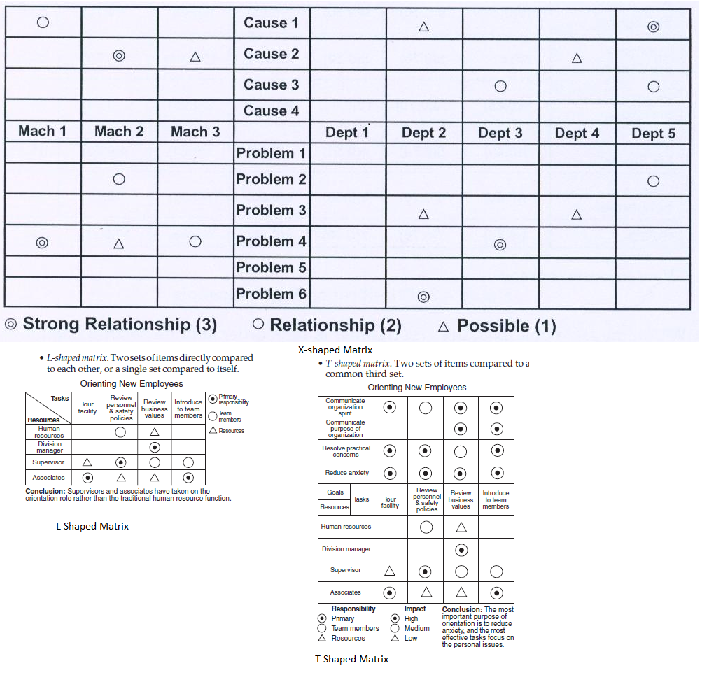
Examples of Matrix Diagram
Prioritization Matrices
Prioritization Matrices are used to narrow down options through a systematic approach of comparing choices by selecting, weighing, and applying criteria. The original Japanese matrix data-analysis tool would arranged data into a matrix diagram. Allowing a large array of numbers to be seen at one time. The degree of correlation would be entered into the proper cell. This technique is the most complex of the tools introduced so far. It is not as easy to use, due to its greater emphasis on statistical analysis. To counter the heavy mathematical emphasis of the matrix data-analysis, the prioritization matrices approach was developed. There are several matrices to build and use in this approach. The answers that result from these matrices will be the basis for decision-making. To use the prioritization matrices, the key issues and concerns have been identified and alternatives have been generated. The need is to determine the option to use. Other similar decision-making techniques have been developed along these lines, such as the type developed by Kepner and Tregoe in The Rational Manager(Kepner,1965). The prioritization matrix is a system for decision-making such that computer usage is not a requirement. However, the math can become intricate. The prioritization matrix quickly surfaces basic disagreements so they may be resolved upfront. It forces a team to focus on the best thing(s) to do, and not everything they could do, dramatically increasing the chances for implementation success. It limits “hidden agendas” by surfacing the criteria as a necessary part of the process. It increases the chance of follow-through because consensus is sought at each step in the process (from criteria to conclusions). It reduces the chances of selecting someone’s “pet project”
M. Brassard in The Memory Jogger PIus+ (Brassard, 1989) provides a description of three types of prioritization matrices that can be used:
- The full analytical criteria method: It is used when Smaller teams are involved (3–8 people); Options are few (5–10 choices); There are relatively few criteria (3–6 items);Complete consensus is needed; The stakes are high if the plan fails;
- The Consensus Criteria Method: It is used when Larger teams are involved (8 or more people); Options are many (10–20 choices); There is a significant number of criteria (6–15 items); Quick consensus is needed to proceed.
- The combination I.D. imatrix method: This method is different from the other two methods because it is based on cause and effect, rather than criteria. It is used when Interrelationships among options are high, and finding the option with the greatest impact is critical.
The full analytical criteria method is the most complex of the three methods, but the consensus criteria method can be a bit involved as well. They both require sets of matrices to form the final matrix. The criteria in both cases get prioritized, weighted, and applied against the options generated. A decision, based on numerical values, can generally be obtained as a result. The combination l.D./matrix method is used to prioritize options. The interrelationship digraph (l.D.) can be used since it does not numerically value the cause-and-effect relationship. In an L-shaped matrix, which compares all of the options to each other, the strength values can be developed.
The full analytical criteria method: Example:
1. Agree on the ultimate goal to be achieved in a clear, concise sentence
If no other tools are used as input, produce a clear goal statement through consensus. This statement strongly affects which criteria are used.
| Choose the most enjoyable vacation for the whole family |
|---|
2. Create the list of criteria
Brainstorm the list of criteria or review previous documents or guidelines that are available, e.g., corporate goals, budget-related guidelines.
|
|---|
The team must reach consensus on the final criteria and their meanings, or the process is likely to fail!
3. Using an L-shaped matrix, weight all criteria against each other
- Reading across from the vertical axis, compare each criterion to those on the horizontal axis.
- Each time a weight (e.g., 1, 5, 10) is recorded in a row cell, its reciprocal value (e.g., 1/5, 1/10) must be recorded in the corresponding column cell.
- Total each horizontal row and convert to a relative decimal value known as the “criteria weighting.”


4. Compare ALL options relative to each weighted criterion
- For each criterion, create an L-shaped matrix with all of the options on both the vertical and horizontal axis and the criteria listed in the left hand corner of the matrix. There will be as many options matrices as there are criteria to be applied.
- Use the same rating scale (1, 5, 10) as in Step 3, but customize the wording for each criterion.
- The relative decimal value is the “option rating.”


The whole number (1, 5, 10) must always represent a desirable rating. In some cases this may mean “less,” e.g., cost; in others this may mean “more,” e.g., tasty.
5. Using an L-shaped summary matrix, compare each option based on all criteria combined
- List all criteria on the horizontal axis and all options on the vertical axis.
- In each matrix cell multiply the “criteria weighting” of each criterion (decimal value from Step 3) by the “option rating” (decimal value from Step 4). This creates an “option score.”
- Add each option score across all criteria for a row total. Divide each row total by the grand total and
convert to the final decimal value. Compare these decimal values to help you decide which option to pursue.


6. Choose the best option(s) across all criteria
While this is more systematic than traditional decision-making, it is not a science. Use common sense and judgment when options are rated very closely, but be open to non-traditional conclusions as well.
Example of consensus criteria method
A team had to choose which of four projects to pursue first. To help them decide, they identified four criteria for selection and their weights as follows: high impact on the bottom line (weight=0.25), easy to implement (0.15), low cost to implement (0.20), and high impact on customer satisfaction (0.40). The four projects were then ranked according to each criterion; the results are shown in the table below.


In the above example, the team would begin with project #2 because it has the highest score. If the team had difficulty reaching a consensus on the weights or ranks, they could use totals or a method such as the nominal group technique described below.
ACTIVITY NETWORK DIAGRAMS (AND)
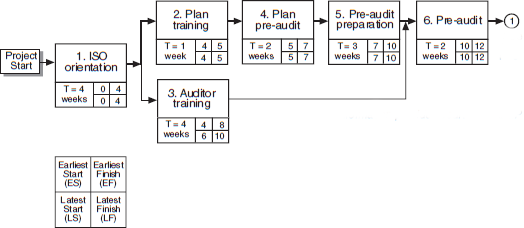
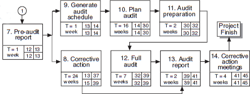
Activity network diagrams, sometimes called arrow diagrams, have their roots in well-established methods used in operations research. The arrow diagram is directly analogous to the Critical Path Method (CPM) and the Program Evaluation and Review Technique (PERT). These two project management tools have been used for many years to determine which activities must be performed when they must be performed, and in what order. Unlike CPM and PERT, which require training in project management or systems engineering, arrow diagrams are greatly simplified so that they can be used with a minimum of training. The figure below, an illustration of an arrow diagram, is reproduced here.


PERT network for constructing a house
Activity network diagram allows a team to find both the most efficient path and realistic schedule for the completion of any project by graphically showing total completion time, the necessary sequence of tasks, those tasks that can be done simultaneously, and the critical tasks to monitor. All team members have a chance to give a realistic picture of what their piece of the plan requires, based on real experience. Everyone sees why he or she is critical to the overall success of the project. Unrealistic implementation timetables are discovered and adjusted in the planning stage. The entire team can think creatively about how to shorten tasks that are bottlenecks. The entire team can focus its attention and scarce resources on the truly critical tasks
Example of Activity network diagrams
- Assemble the right team of people with firsthand knowledge of the subtasks
- Brainstorm or document all the tasks needed to complete a project. Record on Sticky Notes.
- Find the first task that must be done, and place the card on the extreme left of a large work surface


- Ask: “Are there any tasks that can be done simultaneously with task #1?” If there are simultaneous tasks, place the task card above or below task #1. If not, go to the next step.
- Ask, “What is the next task that must be done? Can others be done simultaneously?” Repeat this questioning process until all the recorded tasks are placed in sequence and in parallel. At each step always ask, “Have we forgotten any other needed tasks that could be done simultaneously?”
- Number each task, draw the connecting arrows, and agree on a realistic time for the completion of each task. Record the completion time on the bottom half of each card. Be sure to agree on the standard time unit for each task, e.g., days, weeks.

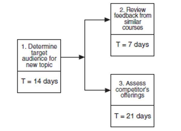
- Determine the project’s critical path
- Any delay to a task on the critical path will be added to the project’s completion time, unless another task is accelerated or eliminated. Likewise, the project’s completion time can be reduced by accelerating any task on the critical path.
- There are two options for calculating the total critical path and the tasks included within it.Longest cumulative path. Identify total project completion time. Add up each path of connected activities. The longest cumulative path is the quickest possible implementation time. This is the project’s critical path.


Calculated slack. Calculate the “slack” in the starting and completion times of each task. This identifies which tasks must be completed exactly as scheduled (on the critical path) and those that have some latitude. Determining the longest cumulative path is simpler than calculating the slack, but can quickly become confusing in larger ANDs. The calculated slack option determines the total project and slack times, and therefore the total project time and critical path are identified “automatically.”


Gantt Charts (Bar Charts)
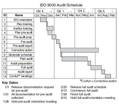
Gantt charts (bar charts), named after Henry Gantt, display activities or events as a function of time (or cost). It is a simple tool that uses horizontal bars to show which tasks can be done simultaneously over the life of the project. Each activity is shown as a horizontal bar with ends positioned at the starting and ending dates for the activity.
Advantages of Gantt charts include:
- The charts are easy to understand.
- Each bar represents a single activity.
- It is simple to change the chart.
- The chart can be constructed with minimal data.
- Program task progress versus date is shown.
Disadvantages of Gantt charts include:
- They do not show interdependencies of activities.
- The effects of the early or late start of an activity are not shown.
- There is no means to indicate the variation in the expected time to complete an activity.
- The details of an activity are not indicated.
- There is little predictive value to this presentation of data.
The bar charts indicate only an ambiguous description of how the project as a system reacts to changes. The network relationship between activities that are indicated in AND are not shown in the Gantt chart.



Planning Grid
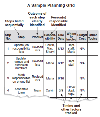
A planning grid helps you identify the resources for, and outcomes of, each step in a project. The following features make it easy to use:
• Its table form quickly summarizes the tasks needed to complete a project.
• You can easily customize it to track information specific to your project.
• It is easy to create with pen and paper.
The steps for completing a planning grid are as follows:
- Specify the final outcome of the project.
- Identify the final step and what it produces.
- Identify the starting point and what it produces.
- Brainstorm a list of steps that occur between the starting point and the final step.
- Clean up the list by eliminating duplication, combining related ideas, rewriting unclear statements, and so forth.
- Label the columns of a grid as shown in the example at left.
- Write your final list of steps in sequence down the side of the grid.
- Fill in the Product column for each step.
- Enter a tentative due date or time for each step.
- Revise steps if necessary.
- Complete the remaining columns.
- The categories across the top of the grid can vary, depending on the needs of your project.

Subscribe to get access
Read more of this content when you subscribe today.
If you need assistance or have any doubt and need to ask any questions contact us at preteshbiswas@gmail.com. You can also contribute to this discussion and we shall be happy to publish them. Your comment and suggestion is also welcome.